SpasGo
A wellness and travel brand bringing spa experiences, hotels, destinations and curated packages into one considered brand world.
Brand identity and wellness travel experience

What the project needed.
SpasGo needed a visual identity that could bridge wellness and travel. It had to feel calm and welcoming while remaining clear and flexible across digital interfaces, print collateral, physical environments and branded products.
Turning the brief into a system.
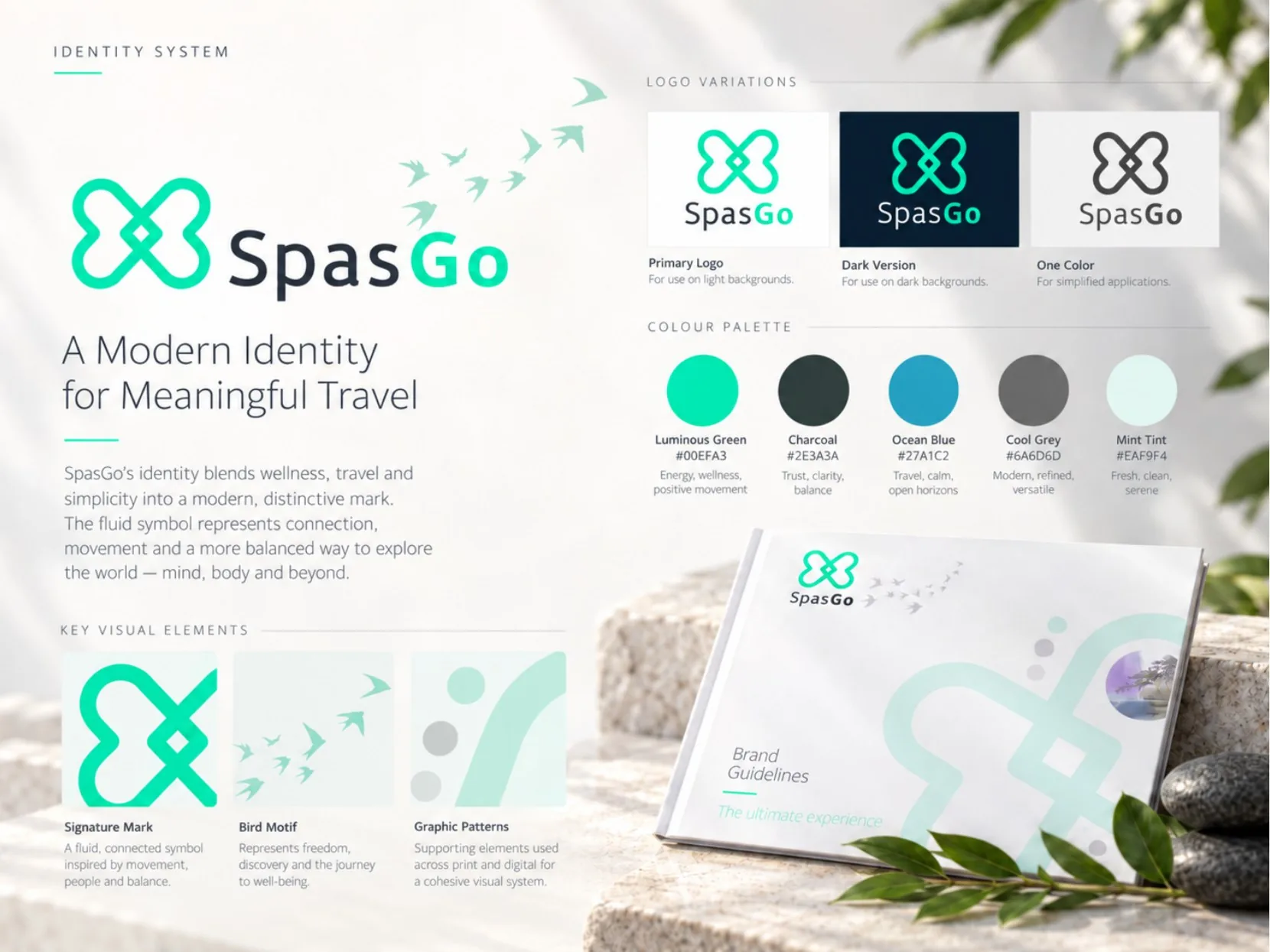
The fluid loop symbol represents connection and movement. A fresh teal and mint palette, charcoal neutrals, clean typography and supporting bird and graphic motifs create a recognisable system. The portfolio explores how that system can move from the logo into digital booking experiences and guest touchpoints.
From thinking to application.
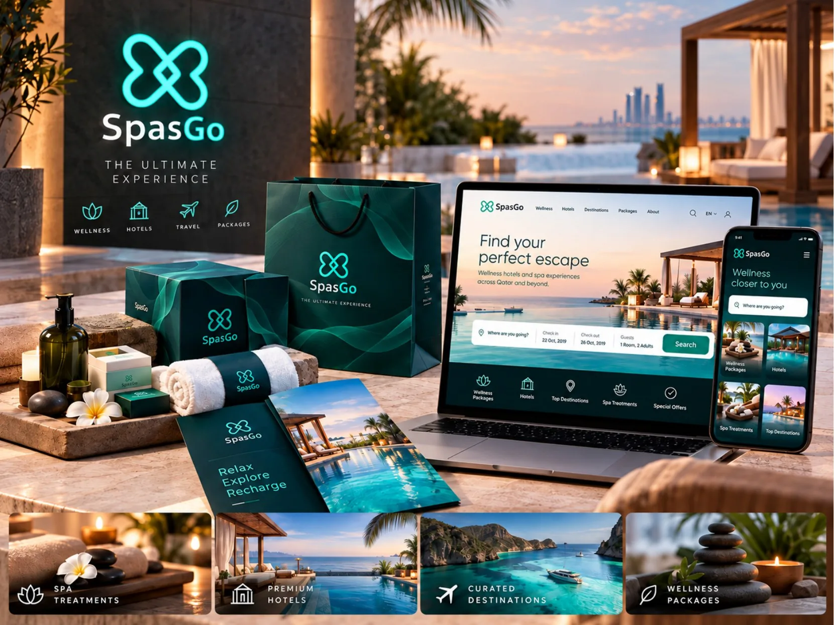
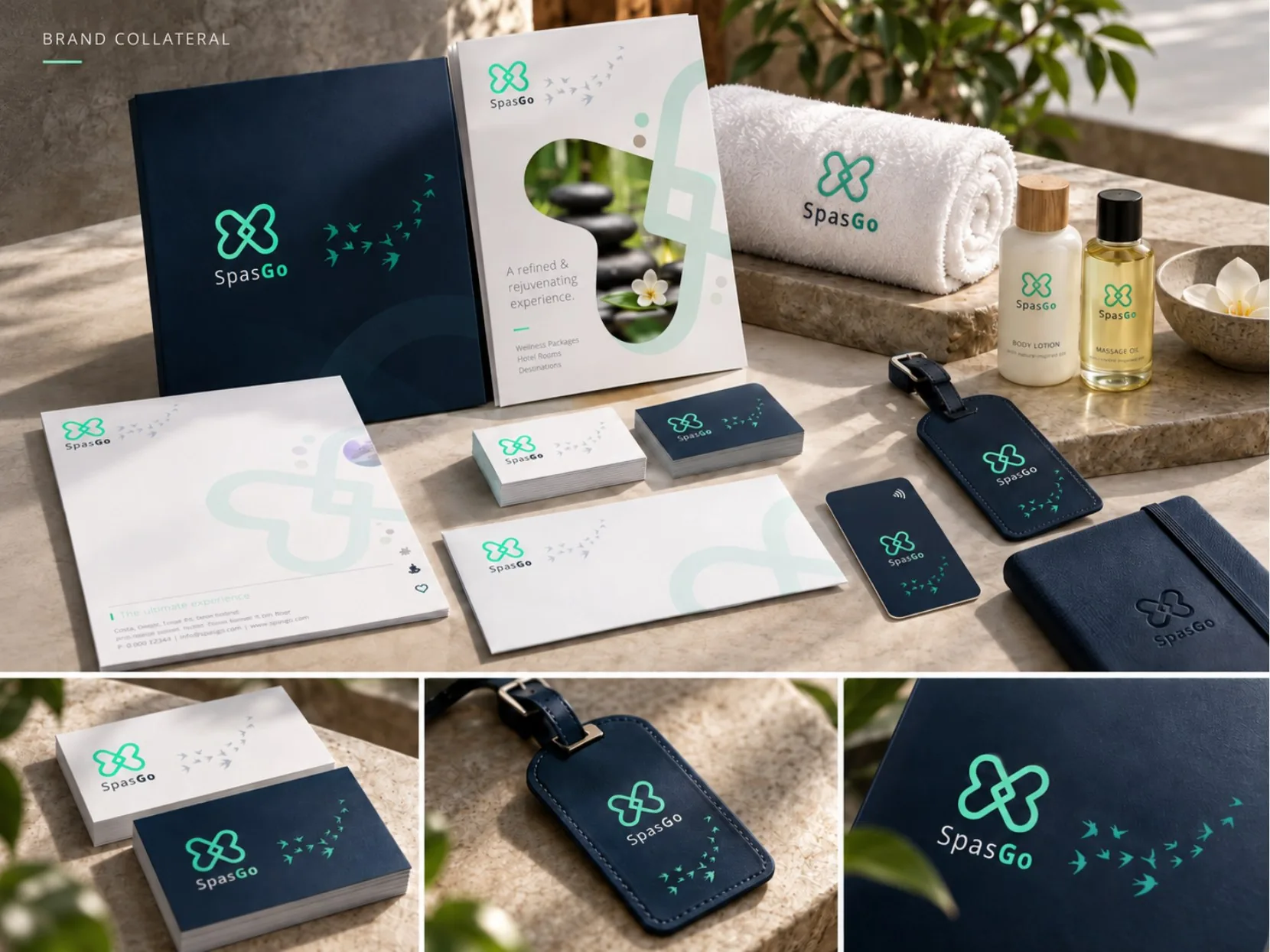
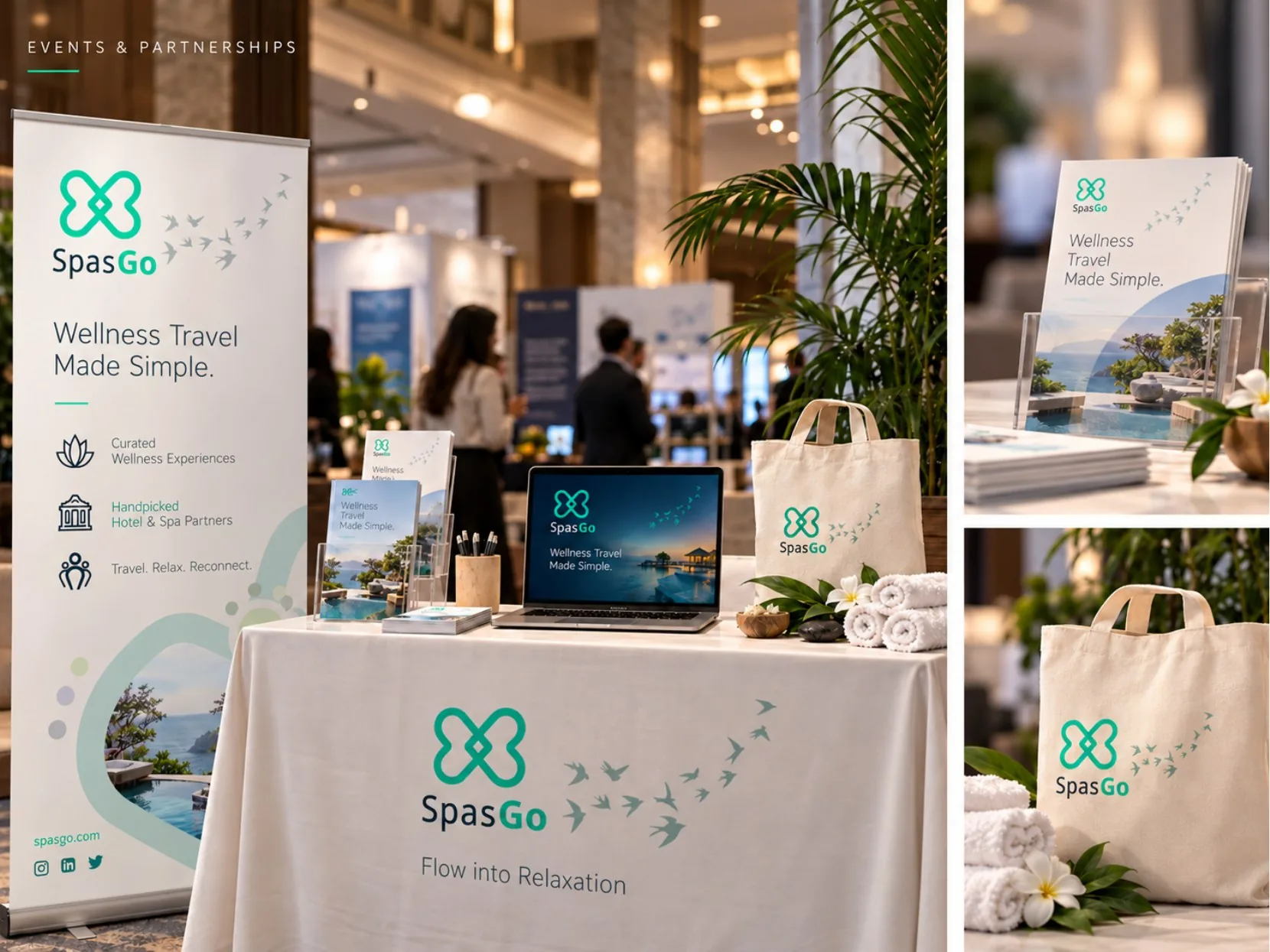
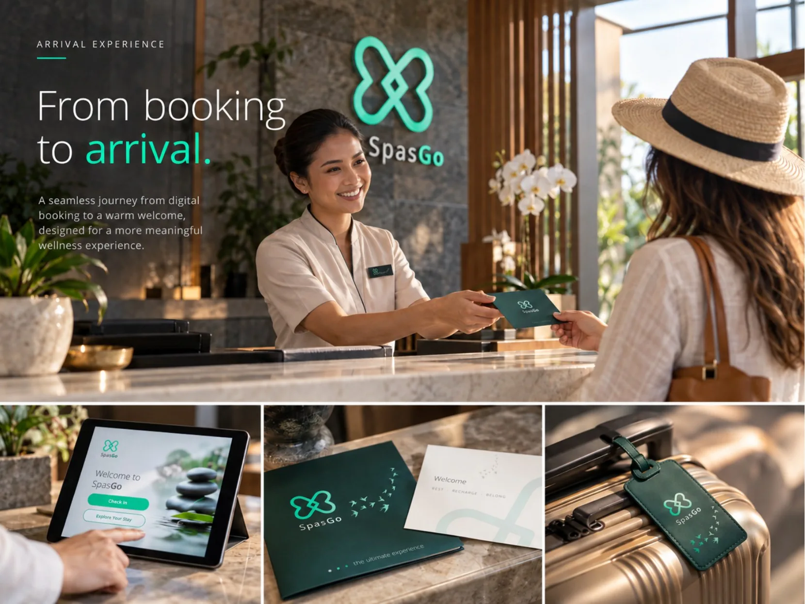
The wider portfolio shows the identity applied to websites, mobile screens, collateral, wellness products, corporate environments and event presentation. A 2018 Upwork contract specifically records a SpasGo wellness-platform T-shirt design. The case study presents the broader visual system shown in the supplied portfolio.
What shaped the project.
Brand identity and wellness travel experience
- Logo and identity system
- Colour palette and supporting graphic elements
- Brand guidelines and visual direction
- Website and mobile experience design direction
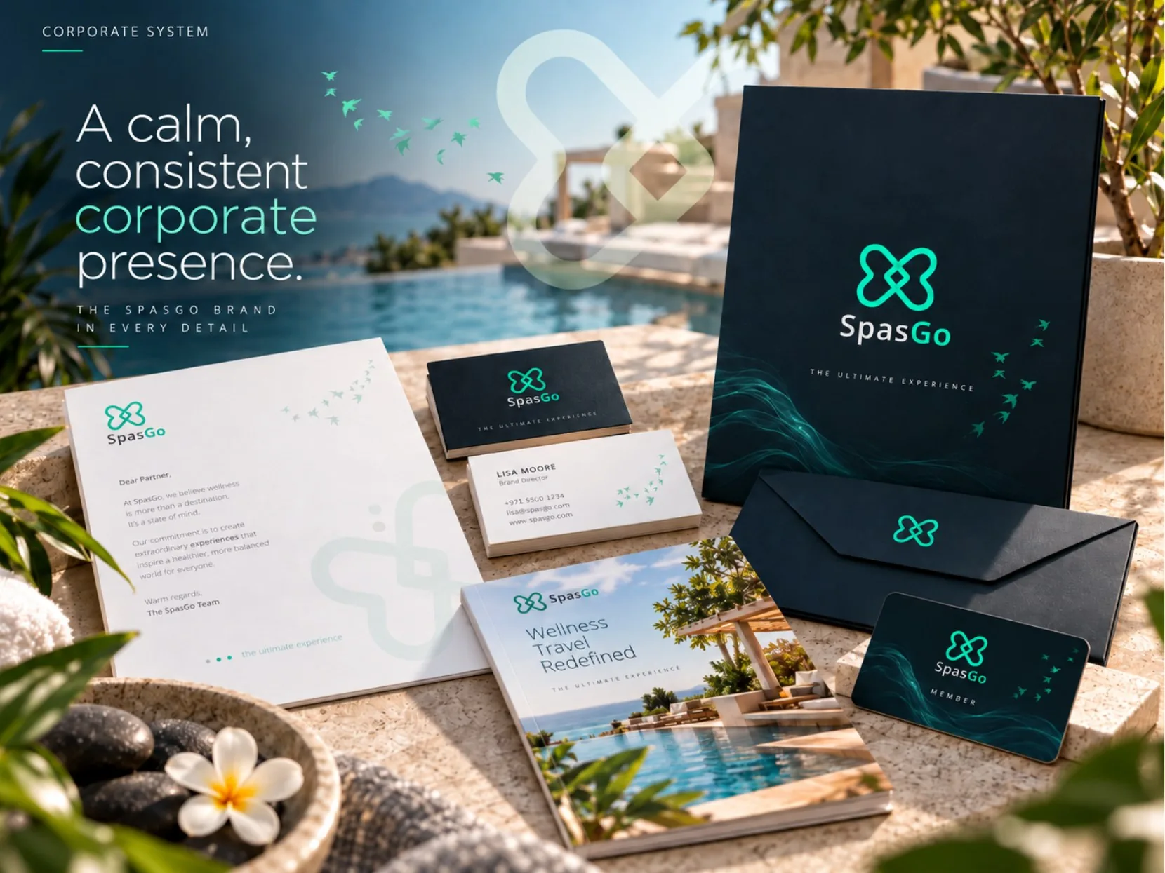
- Corporate and printed collateral
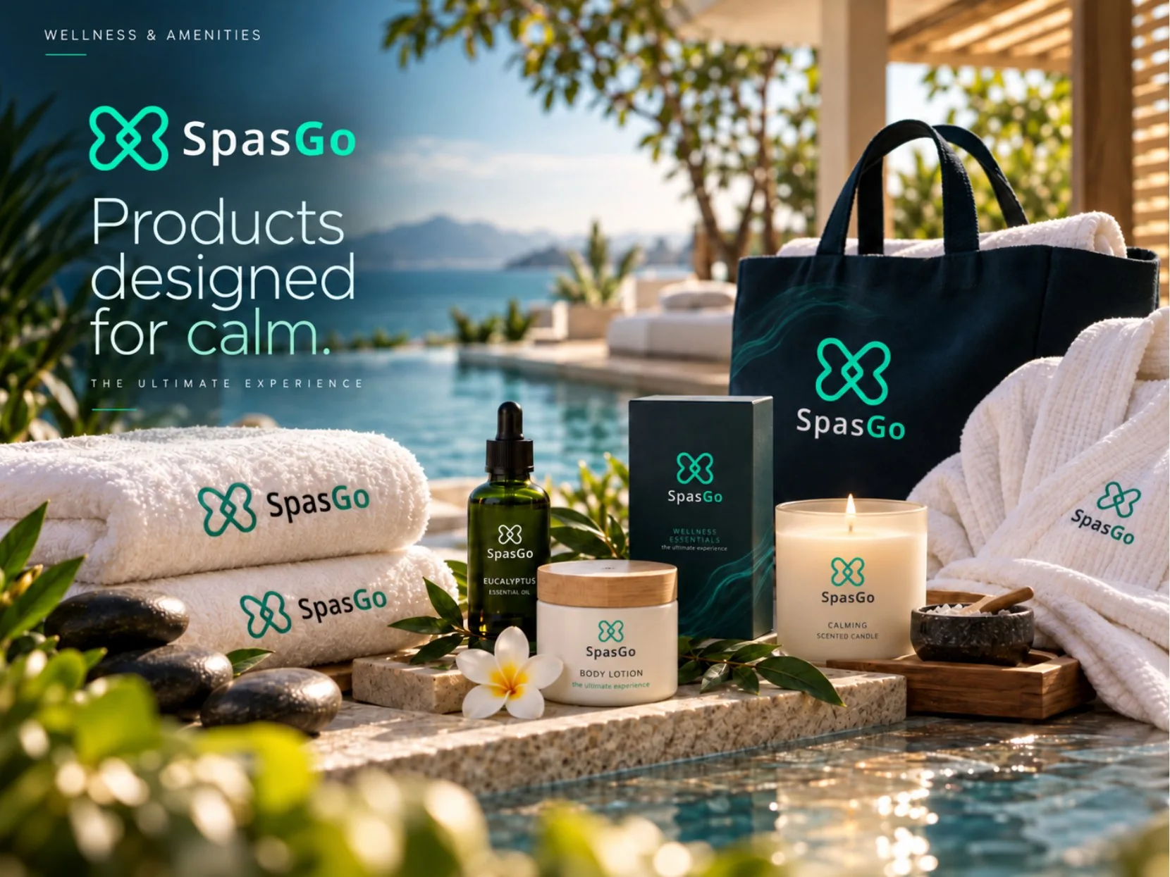
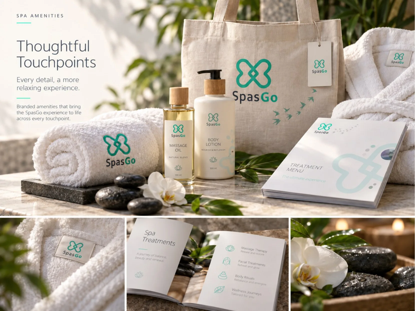
- Wellness and amenity product applications
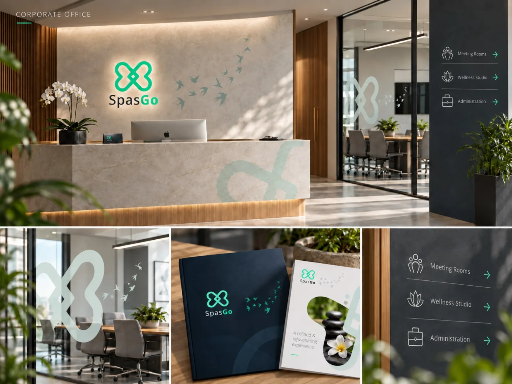
- Office, reception and wayfinding applications
- Event and partnership presentation
- Branded T-shirt design
A consistent identity connects the digital, corporate and guest-facing parts of the SpasGo experience, using a calm visual language that can flex across different applications.
The work, in detail.
Explore the full presentation. Select any page to enlarge it.
 View full design ↗
 View full design ↗
 View full design ↗
 View full design ↗
 View full design ↗
 View full design ↗
 View full design ↗
 View full design ↗
 View full design ↗
The portfolio includes visualisations of digital, environmental and product applications. The Upwork record specifically confirms a branded T-shirt design engagement.
The next project starts with the actual problem.
Share the context, the current material and what needs to improve.
Start a conversation ↗